This years exercise in painting Master class was making a painting based on the style of Klimt.
This does not mean trying to make a copy of one of his paintings, but studying his painting style and composition principles.
I never liked Klimt much, I considered him to be rather kitsch: a lot of gold and coloured patterns overwhelming the portrayed models.
But to my surprise I found that there was a lot to learn from him: especially his composition methods. Also how he paints the human parts very fragile, almost vulnerable, easy to hurt, and breakable within the storms of colours and patterns around them.
Anyway, the exercise was even made worse by the theme that we had to use for the painting: intimacy.
I did not want to paint the obvious subjects: "the kiss", woman and child, two lovers, that kind of (in my male opinion) romantic stuff. So I decided to go for a girl being absorbed by reading a book.
On google images I found a picture that could serve as basis, see above.
I made a lot of small sketches to make the theme work, here are just a few of them.
I tried all kind of ideas: positioning the figure in the frame, making the scene "flat" (a Klimt signature: a total lack of depth in his paintings), contrasts between colour and flesh, where and how to add textures/patterns, where less exuberant areas, centralised composition or dynamic, what colours to use etc.
Then I choose one idea and started painting on a large canvas: 90x80cm.
I had decided earlier that I wanted to do something in red/orange/yellow, for no obvious reason. Just because I had not seriously painted in these colours for some time.
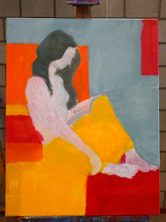
Here you see the first version. A total failure. The figure too small, wrong location, not interesting at all.
You can see on the new thin lines that I enlarged and repositioned the figure within the composition.
By placing it higher and o the left, the subject filled the canvas better, and the dynamic came from the subject, not from the coloured blocks.

I tried to rebalance the different colour blocks (notice how the red squares form a triangle, to compensate the yellow triangle).
Also, the one visible leg with the arm over it did not work, it looked comical. Furthermore I enlarged the yellow blanket, and resized it to balance the colours.
This was how the basis looked like, at the point where I would start adding details and textures.
But after these three sessions I was still totally dissatisfied.
So I made a picture, then a print and used some tracing paper to start all over again. And I arrived at some new ideas for the composition.
I coloured it in Gimp, and found another way to do the image,.
I am still working on the new version, it's not very far from being finished.
More to come in the next post.
This does not mean trying to make a copy of one of his paintings, but studying his painting style and composition principles.
I never liked Klimt much, I considered him to be rather kitsch: a lot of gold and coloured patterns overwhelming the portrayed models.
But to my surprise I found that there was a lot to learn from him: especially his composition methods. Also how he paints the human parts very fragile, almost vulnerable, easy to hurt, and breakable within the storms of colours and patterns around them.
Anyway, the exercise was even made worse by the theme that we had to use for the painting: intimacy.
I did not want to paint the obvious subjects: "the kiss", woman and child, two lovers, that kind of (in my male opinion) romantic stuff. So I decided to go for a girl being absorbed by reading a book.
On google images I found a picture that could serve as basis, see above.
I made a lot of small sketches to make the theme work, here are just a few of them.
I tried all kind of ideas: positioning the figure in the frame, making the scene "flat" (a Klimt signature: a total lack of depth in his paintings), contrasts between colour and flesh, where and how to add textures/patterns, where less exuberant areas, centralised composition or dynamic, what colours to use etc.
Then I choose one idea and started painting on a large canvas: 90x80cm.
I had decided earlier that I wanted to do something in red/orange/yellow, for no obvious reason. Just because I had not seriously painted in these colours for some time.
Here you see the first version. A total failure. The figure too small, wrong location, not interesting at all.
You can see on the new thin lines that I enlarged and repositioned the figure within the composition.
By placing it higher and o the left, the subject filled the canvas better, and the dynamic came from the subject, not from the coloured blocks.

I tried to rebalance the different colour blocks (notice how the red squares form a triangle, to compensate the yellow triangle).
Also, the one visible leg with the arm over it did not work, it looked comical. Furthermore I enlarged the yellow blanket, and resized it to balance the colours.
This was how the basis looked like, at the point where I would start adding details and textures.
But after these three sessions I was still totally dissatisfied.
So I made a picture, then a print and used some tracing paper to start all over again. And I arrived at some new ideas for the composition.
I coloured it in Gimp, and found another way to do the image,.
I am still working on the new version, it's not very far from being finished.
More to come in the next post.


An interesting process. And you're very careful in documenting each step - when I try to record my process, I invariably forget to photograph one or two stages.
ReplyDeleteThanks Michael, I even left out some stages......
ReplyDelete